The Frame Work
To stay in line with Human Computer Interaction principles, I picked a very limited pallet that would compliment each colour;
Light grey, mid grey, dark grey, white and sun-burnt orange. With this, I could have the main banner as the darkest grey, the lightest grey contrast with this for the main page area and the mid tone for any unused space. White could then be used for main text with the orange contrast occasionally for the end of statement/ long headings just to break up the monotony. I played around a lot with noise and slight gradients just to take the flat look away from the template then had it reviewed by a couple of graphic designers.
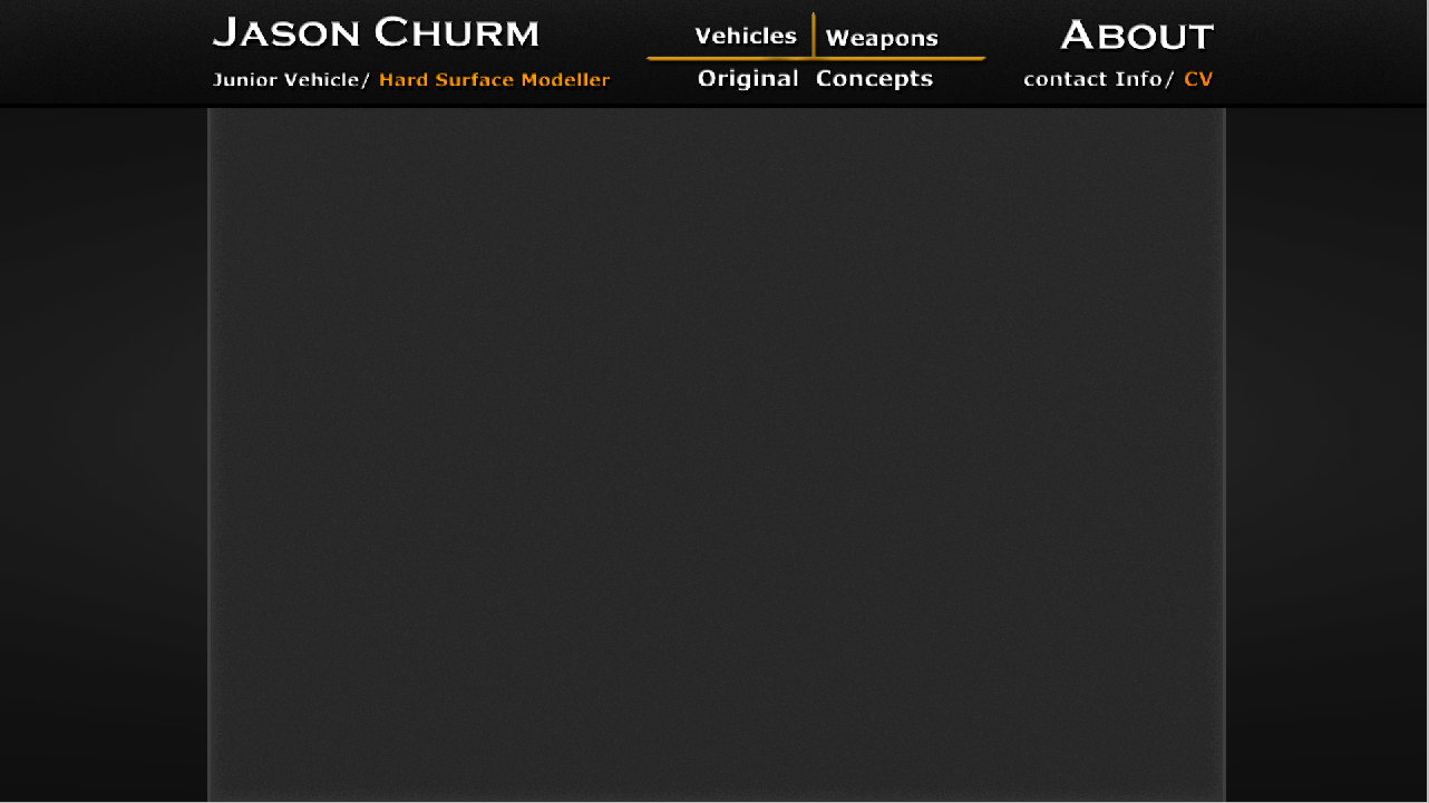
Navigation wise, clicking my name/ prefix will return the portfolio to the "Vehicles" page. Clicking any of the three subheadings; Vehicles, Weapons or Original Concepts will re-direct the viewer to the appropriate page. Clicking the "about: Contact info/CV" segment will re-direct the user to the further contact details page. Every page follows the exact same format, making it an incredibly easy website to navigate at a first glace.
Vehicle Page
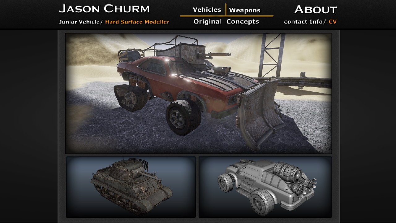
Clicking the "Vehicle" button in the header will bring you to this page. To keep things nice and simple, there will be three nicely formatted images of past work with perspective shots. Each one has a slight inner shadow to give them a more cinematic and artistic feel. The user will be able to scroll down the page to view more images as I create more vehicles although these will follow the two smaller image formatting. The large image will have the slight animation of sand/ dust particles to make it look far less static although doing this without increasing loading time may be difficult. Clicking any of the images will direct the user to its assigned "asset breakdown" page.
The slight inner glow/ shadow helps bridge the colour difference from renders and the website colour pallet.
Weapons Page
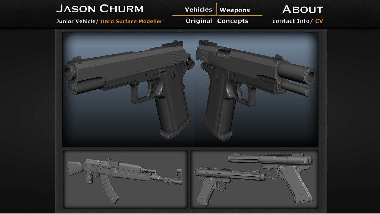
This follows the exact same style as the vehicle page, ensuring the image box positions are the same identical size and shape. I'll try to keep the number of assets from both sections consistent so every time a vehicle asset is completed, a weapon asset will go in to production etc...
Original Concepts
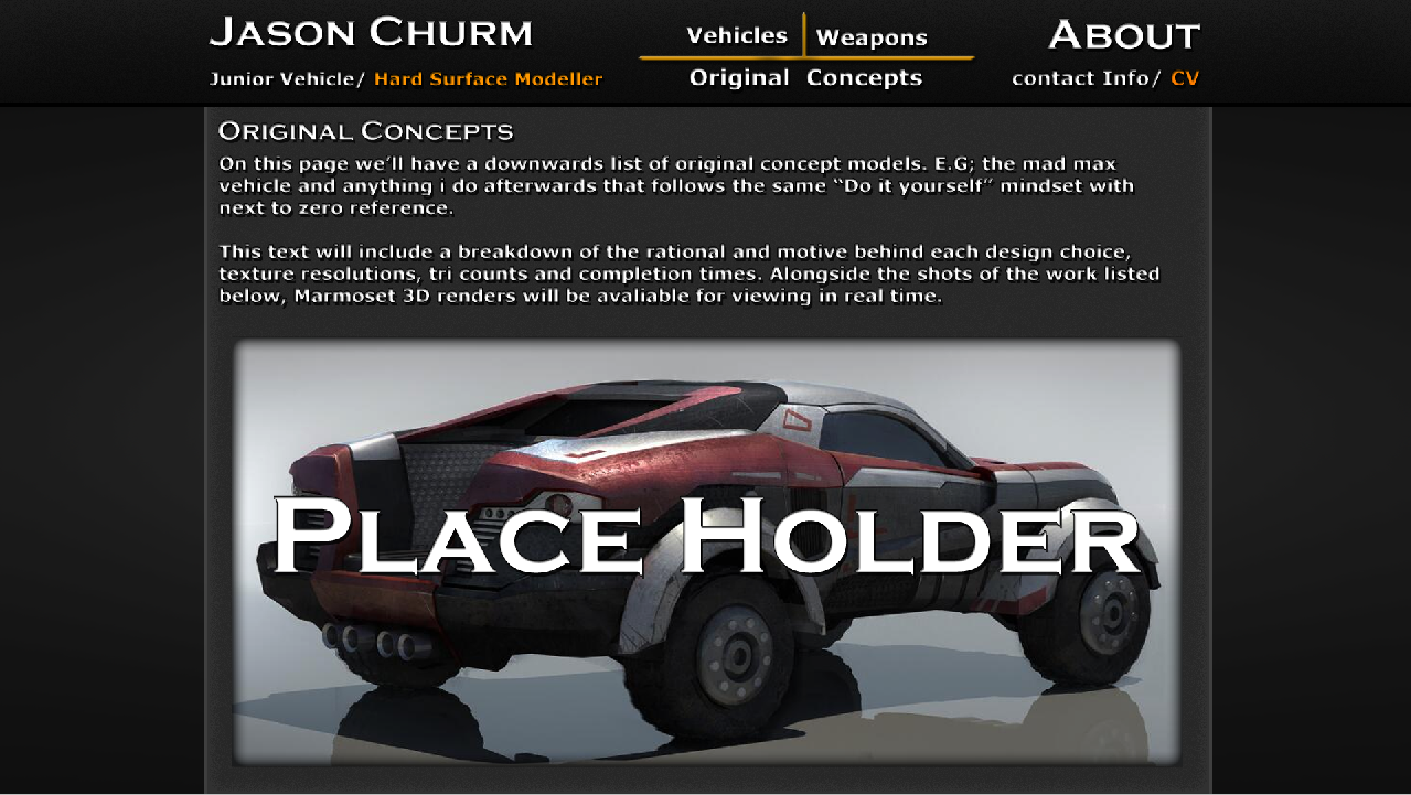
Mixing the formatting slightly, this page has the two smaller boxes removed and the larger one moved further downwards so room is available for brief text. The text is formatted to the left hand column to remain neat and provides a basic breakdown of the rational and motive behind the construction of any original concepts i create. This allows me to explore items such as robots and anything outside of the weapon/ vehicle areas that could help show myself off as a flexible worker without derailing the entire portfolio or changing my focus. Clicking the large image will re-direct the viewer to its relevant asset breakdown page, identical in form to the weapon/ vehicle breakdowns. The formatting of "Header, Paragraph, Large scale image" will be repeated down the page for each newly created original concept.
I used a placeholder image for this page as I have ran out of vehicle/ weapon related work that I'm willing to show.
Asset Breakdown
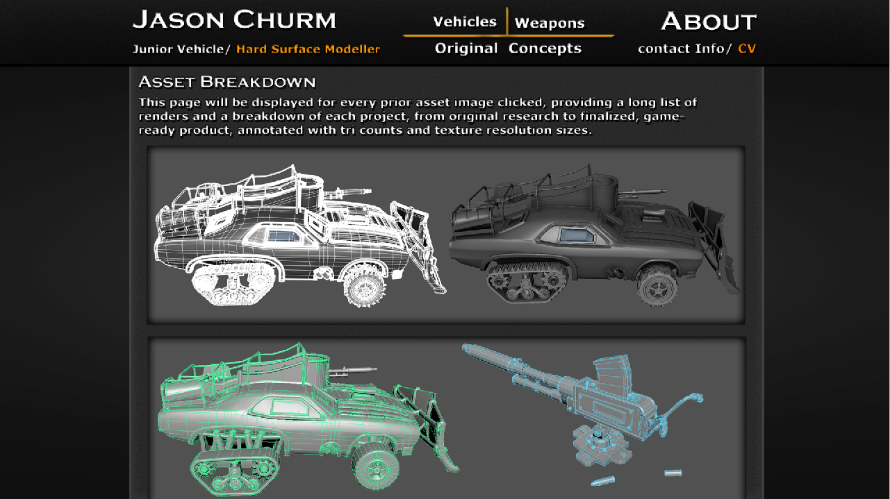
This page format/ layout will be shown for any asset clicked on from any of the Vehicle, Weapons or original concept pages. Similar to the original concept page, there will be a heading and basic paragraph explaining what the asset is/ was used for, keeping it concise and formatting all text to the left hand column.
Multiple images of each stage of the breakdown will be displayed in image boxes very similar to the large asset showcase box from prior pages, scrolling down. To stick with HCI principles, the box width and position on the page will always stay the same, perfectly centered, it will only even be scaled and moved in regards to height. These boxes as shown below look far less overwhelming, showing much more information on screen and are generally a lot more appealing.
About/ Contact Info Page
Clicking the "About" option on the top right of the main bar will bring you to this page. Information such as my name and occupation are displayed first in larger text with contact information such as my email and Linkedin address below, slightly smaller and a brief paragraph on who I, basically as a sales pitch.
A column reserved for past and future clients is then displayed below. To avoid making it too wordy, only the company logos are shown. At this stage, all we have are "Brain Corporation" from the sale of the Agap supermarket level but room is available for future additions. Keeping the same theme, the CV download and software knowledge headings rely entirely on images. This keeps it very minimalist throughout as employers should recognize the software logos at a first glance.
This is arguably the most important page and the home for most written information which makes it quite hard to keep it entirely concise by relying mainly on images has still cut down the required text considerably.
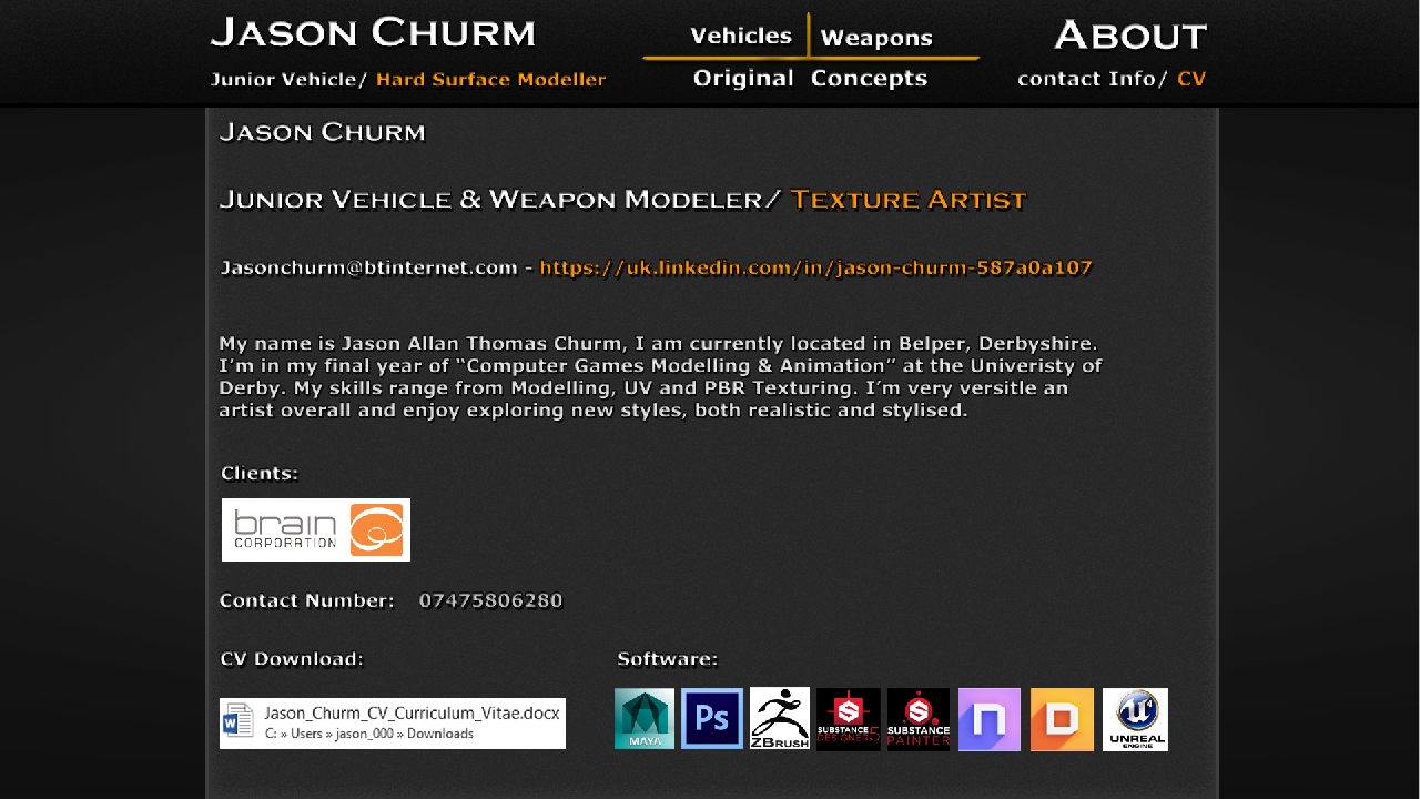
Any further opinions on the design would be fantastic and until then, i believe this design should do a great job of selling myself as a 3D artist.
[EDIT]
After recieving feedback from lecturers, I found that my website design was lacking a few little features that although not neccersary, were very useful.
With the final contact page, I didn't concider the average view time for each portfolio, being less than a minute in even the best case scenario. With this, the person viewing my portfolio would probably be going through a huge amount in quite a small time frame. Anything to bring the visibility up further would be a great selling point and no one in that position would be wanting to download excess files. With this, im refering to the CV download link, in the new version, i have slightly edited this segment as you can see below;

Clicking the CV button would now not only prompt a download for the CV, it would also re-direct the viewer to this page;

Listing my full CV, still in the full colour styling of the website. You would be able to view the rest of the CV by simply scrolling down the page and navigate back to any other via the top bar. As a shortcut to this page, you will also be able to click the orange "CV" button below the about segment to be a little more direct. I'll post the full CV below for context;
Jason Churm
55 Bridge View Home
Tel: 01773 820678
Milford, Belper Mobile
Tel: 07475 806280
Derby Email:
jasonchurm@btinternet.com
Derbyshire www.jason-churm.squarespace.com
DE56 0RG
DE56 0RG
HIGHER
EDUCATION
University of Derby – 2013 - Present
BA (Hons) Computer Games Modelling and
Animation
I currently
attend the University of Derby whereby I am soon due to finish my 2nd
year studies, some of the major modules from the course so far include; Specialist
3D Project, whereby I created a game ready Sherman tank asset whilst adhering
to the design restrictions set by companies such as Wargaming. Real-Time
environment, which involved creating fully functional level block outs before
refining key focus points. Concept development, this included developing a
character, prop and environment, using these as a front to learn both anatomy
and perspective drawing. Video game animation/character rigging consisted of
exploring both old and new work flows through the use of basic constraints and
bone hierarchies to create smooth movement within a previously static mesh.
SECONDARY
EDUCATION
Belper School – 2006 -
2013
A-Levels
Information
Technology BTEC June 2013 Distinction* (A*, A*)
D&T:
Product Design June 2013 C
GCSE’S
Mathematics June 2010 B
Science June 2010 B
Additional
Science June 2010 B
English
Language June 2010 C
English
Literature June 2010 B
French June 2010 D
Art
and Design: Fine Art June 2010 B
Art
and Design BTEC June 2010 Distinction (A, A)
ICT
Practitioners BTEC June
2010 Distinction (A, A)
SKILLS
Technical and software skills
I.T.
proficiency, Adobe Photoshop, Illustrator, Flash and Fireworks. Autodesk Maya
and Max, zbrush, unreal engine 4, marmoset toolbag, Sony Vegas 12 and Microsoft
Office.
Non technical skills
I have
excellent research skills, report writing skills, presentation skills
(including use of powerpoint), team work, organisation, problem solving and
communication abilities.
INTERESTS
I enjoy real
estate development whereby I aid in the family business through evaluating
properties and carrying out property renovations, I also enjoy airsoft as well
as computer building and maintenance as well as gaming, game-jams and archery.
PROFILE
I am an
energetic, self motivated and enthusiastic individual with exceptional communication
skills; who quickly develops a good relationship with all those I have contact
with. I have excellent organisational skills, I relish a challenge and I will
put in the effort to get the results. I am honest, dedicated, trust worthy and
a team player.
REFERENCES
Reference can
be supplied on request.
