With every last one of these portfolios, we discussed the good and the bad in lecture, at times cringing in pain and other times, nearly in tears due to the extreme quality of work. Either way, it was an emotional experience.
Starting with the worst;
http://www.vr-mod.de/
Presentation?
From the start, it doesn't look all too bad at times. Its got a nice list vertical list of images, showing what the artist is capable. Clicking these, loads up a smaller viewer. Im not all too big a fan of this but at the same time, it serves its function. It seems a little odd having a photo-viewer but its not the end of the world. Its quite bare bones all-in-all. Contact wise, it does state "unavailable" so this is slightly worrying but the "about" page is not too bad.
Work quality?
The work quality is all over the place as the artist has tried to cover all forms of modelling and concepting. Some areas such as his character models and props are decent but there's a worrying amount of inconsistency and no information on any of the assets displayed.
Ease of accessibility?
It's pretty easy to access the work you want what is contained in each sub-heading on the main page is a bit of a mystery at first. It's carbon made so not its by default pretty decent.
Opinions?
Honestly it looks unprofessional. No information on any of the assets and they haven't put very much effort in to designing the portfolio. Its a basic template without any further thought.
http://www.binarymoon.co.uk/2012/08/my-3d-art-portfolio/
Presentation?
Presentation wise, it looks the index page of a "guide to modelling" tutorial book. Take that either way but bare in mind, its only a single page. It would be an excellent blog page but not much else. It is possible to find a contact pace by clicking the Title but this just leads to a confusing amount on non-game related pages.
Work Quality?
The work quality isn't too bad and some of the hand painted characters are nice but i feel like they're all aimed towards mobile due to the low detail, low poly models.
Ease of accessibility?
Its basically one page then a maze of directories. It's easy to see the work but anything past that, you wont really have all too much luck.
Opinions?
It's filled with ads and is very poorly structured. It looks very unprofessional and to be entirely honest, "portfolio" shouldn't be in the title. Maybe "art blog" but not portfolio.
https://raulfarre.carbonmade.com/
Presentation?
It's made on Carbonmade so there isn't any presentation issue by default. It's the bog standard background, bog standard interface and to be entirely honest, the text doesn't really fit the vertical image slideshow and the images seem like very half arsed screenshots. It's not up to a good start. Clicking the images directs you to a list of larger scale images but almost all are out of scale and don't really do the work justice. The contact page may be functional but the "about" section has nothing beyond a name and basic location.
Work Quality?
There is a doodle of depressed duck. No i'm not joking, go see for yourself. There are also pixelated pictures of game/movie covers with poorly Photoshopped text and logos. The gun model isn't all too bad but its still not something that would ever make me exactly hold me breath. All in all, I feel like i should avoid posting the link due to public shaming.
Ease of accessibility?
Once again its Carbonmade so the default template is very easy if not boring to navigate.
Opinions?
I'll allow the pictures talk for me.
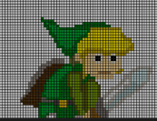
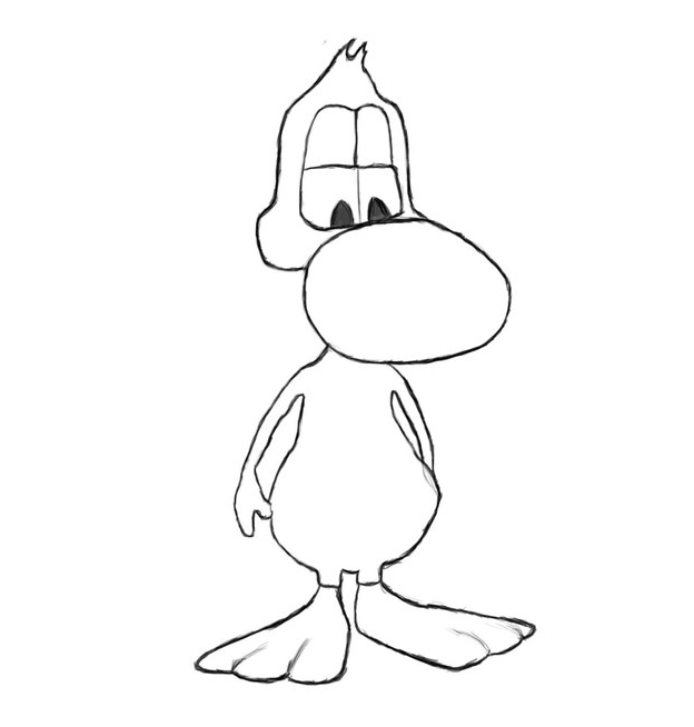
This work quality doesn't seem to have any place in a portfolio. It may not be bad but overall but it doesn't do a very good job of showing off the artist's abilities.
http://www.donpan.co.uk/index.html
Presentation?
Let me start by saying that presentation is the only thing that lets down this portfolio. The work is phenomenal and the artist has incredible talent. Although those videos are simply shown as "Here is a general collection of professional vfx work" though so for all i know, they could be stolen. The website has obviously been home-made and resembles something out of a 90's web-surfing adventure. There is very little structure or formatting which is really a shame due to the work quality but the website looks either horribly outdated or incredibly boring.
Work quality?
If the work displayed is genuinely his own, its phenomenal. If not, the other work on his portfolio is really nice and stylized, too bad there isn't any real design behind the website itself.
Ease of accessibility?
As mentioned previously, the website may not be too difficult to navigate but it looks very slopy and finding contact details seems near impossible.
Opinions?
Improve the website design drastically and the artist could very easily find him/herself an industry job with very little to no effort. Judging from the CG show-reel, the individual probably already has employment and this may be why his/ her website is so lackluster whilst the work truly shines.
http://roripuff.wix.com/roripuff#!__portfolio/3d
Presentation?
Honestly, i didn't even realize this was a portfolio. I thought it was a online test of either a unity, flash or java game due to the entire portfolio being displayed inside a 800x600 window. Firstly, having the "Wix.com" advert at the bottom is a very poor choice. it already looks unprofessional before it even loads. The icons randomly shimmer without reason and pop out the screen in a very odd way.
Work Quality?
The artist has gone for a very minimalist approach. This may work in some situations such as for mobile but i don't believe its been very well executed. Overall, a lot more work needs to be done on both the modelling and texturing sides.
Ease of accessibility?
It's very clunkily designed and both the loading time/ special effects take a lot away from the experience. The artwork is almost hidden, forcing you to work to find it, especially with the tiny scrolling show-reel at the top. I didn't find any real contact details or information beyond well... A highly Photoshopped image of an small child dressed as an angel. If you scroll right to the bottom right corner, you'll find a "contact" button which only has a 50/50 chance of loading, giving full contact information alongside the artist photoshopped in to a centaur.
Opinions?
I feel like this portfolio would bar the individual from any work in the game industry. It shows he/she doesn't take it seriously in the slightest. If the individual wishes to be a photographer or model, i can see the logic behind the imagry but its still quite far fetched.
A few examples of the more troubling work;

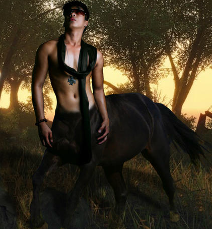
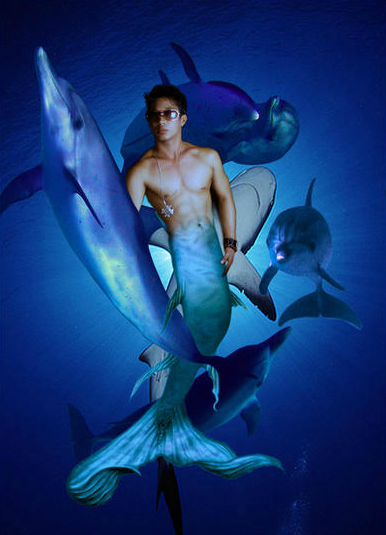
That is all five bad ones and a full breakdown of what i find good/ bad about them and i will return to further edit this post over the next few days.

No comments:
Post a Comment